phonefix report
Nimbus demo
examples/fixed · 7 phone/tablet viewports + desktop guard
Mobile-perfectNo severity-3/4 issues on any device. Desktop guard: layout moved 20.6% — check for desktop regressions.before 17 → after 0 issues
Scores by category (0 = broken · 4 = clean)
| Category | Before | After | Δ | Worst remaining |
|---|---|---|---|---|
| Viewport | 0 | 4 | +4 | clean |
| Layout & overflow | 0 | 4 | +4 | clean |
| Touch & hover | 1 | 4 | +3 | clean |
| Forms | 1 | 4 | +3 | clean |
| Typography | 2 | 4 | +2 | clean |
| Images & video | 1 | 4 | +3 | clean |
| Scroll animation | 2 | 4 | +2 | clean |
| 3D / canvas | 1 | 4 | +3 | clean |
| Runtime errors | 4 | 4 | – | clean |
Devices
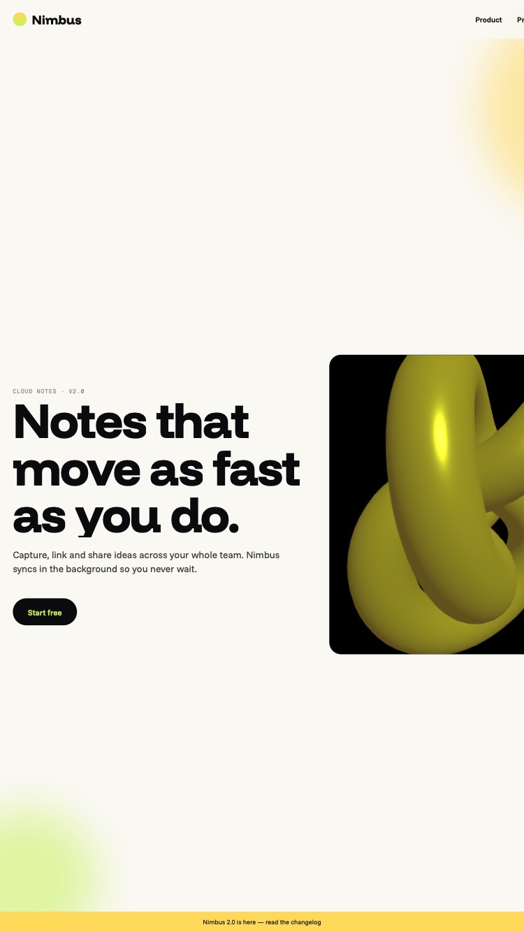

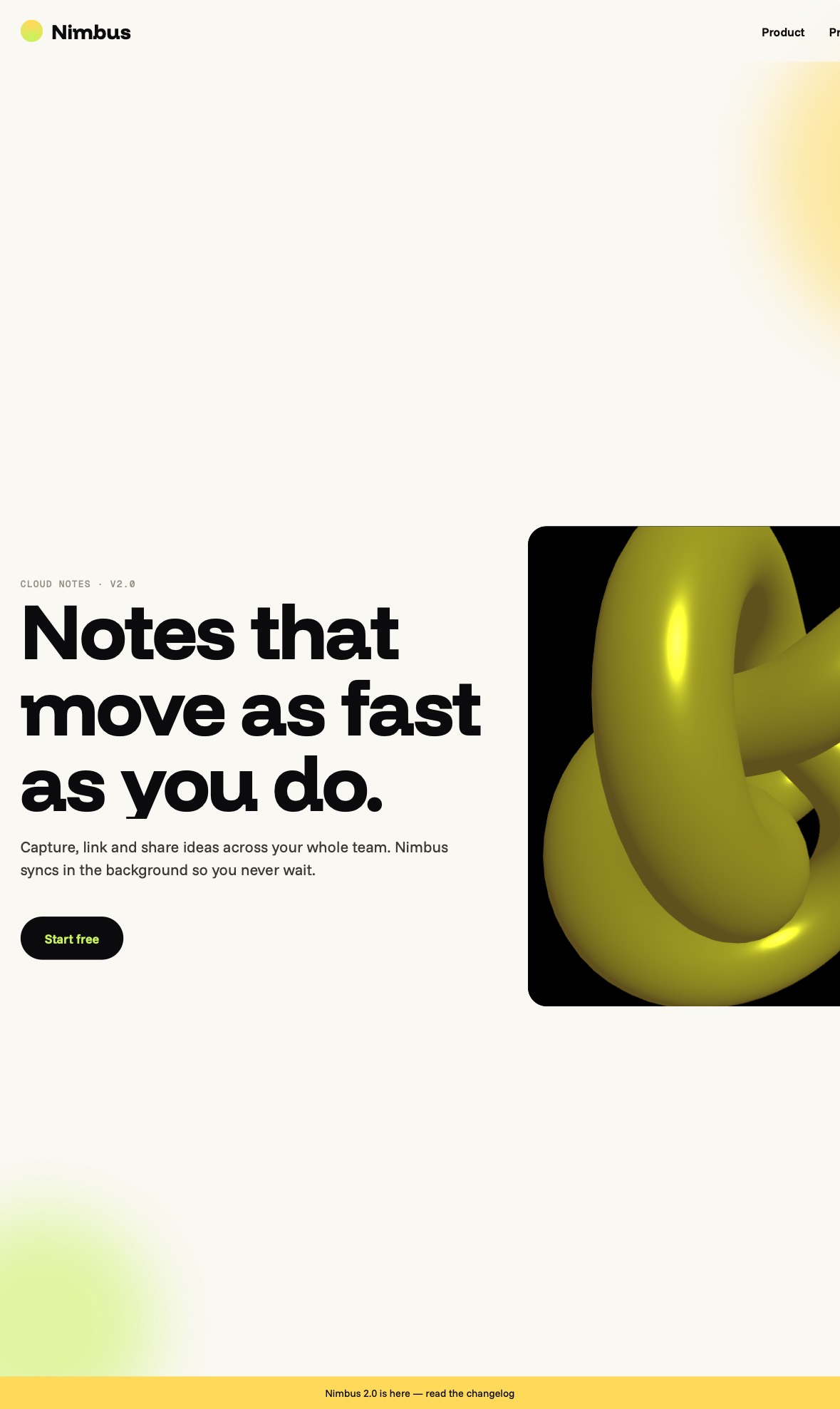

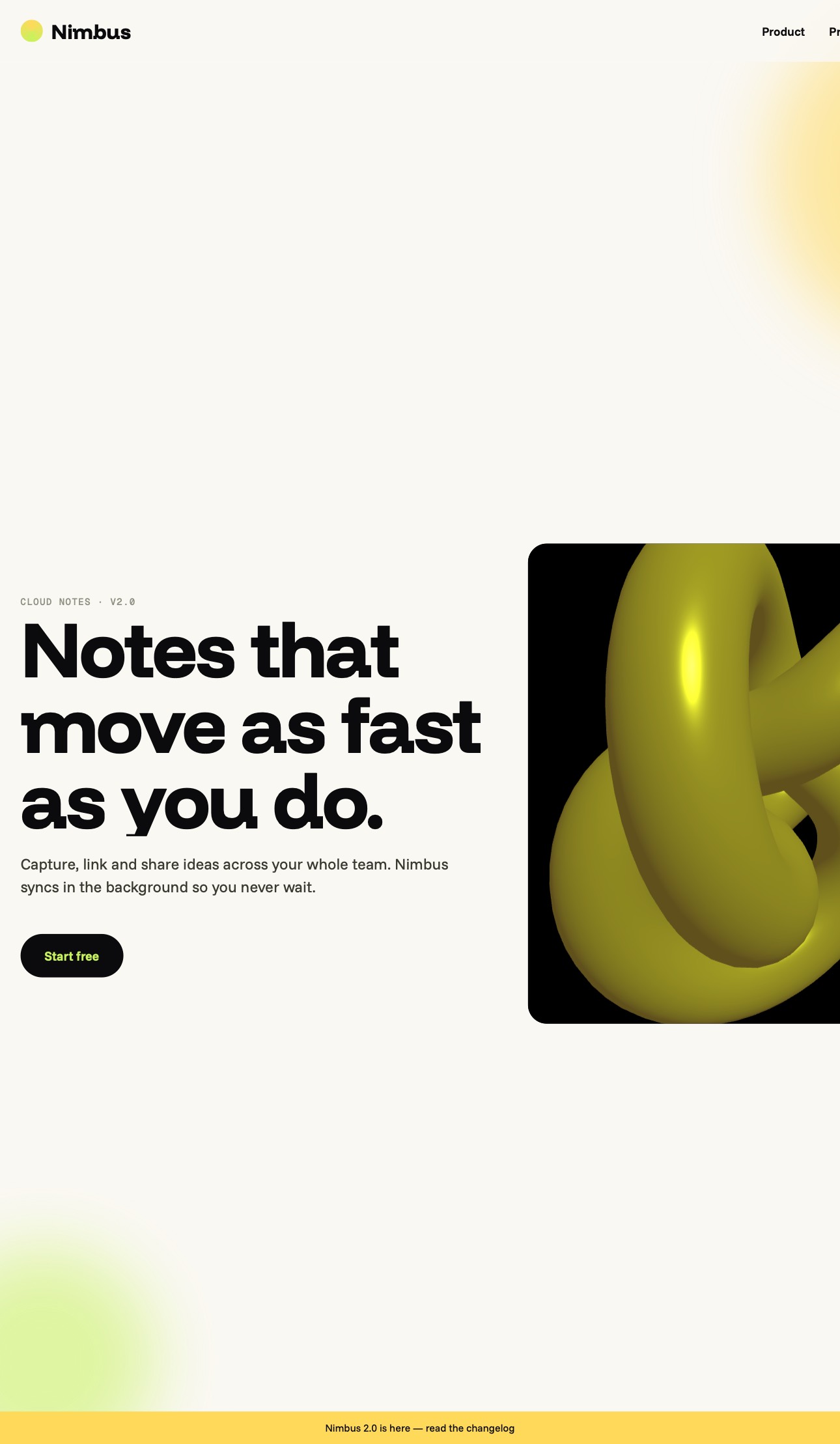

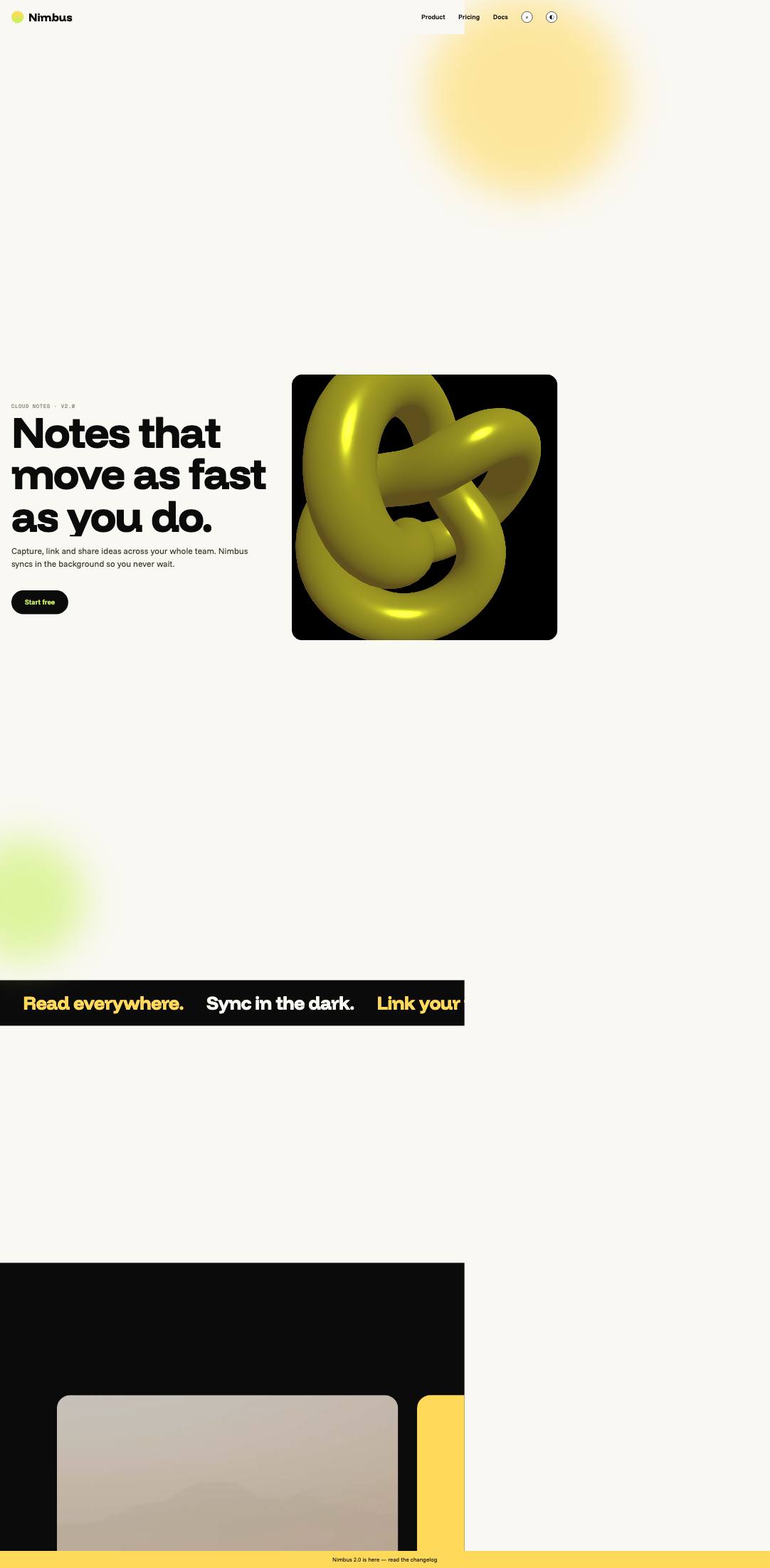

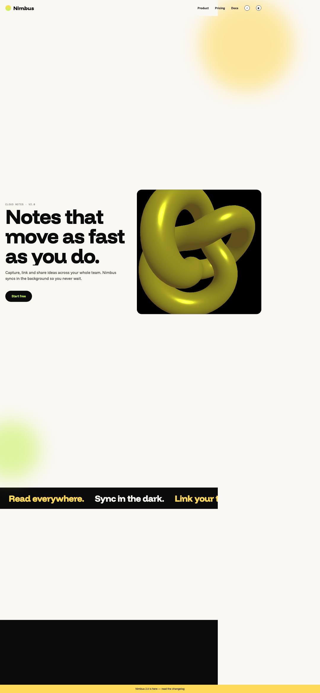

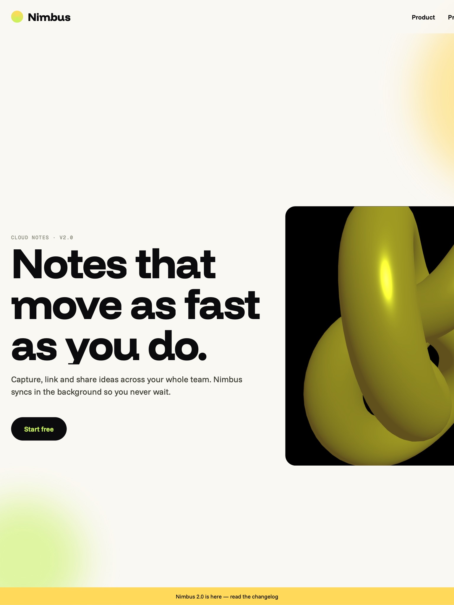
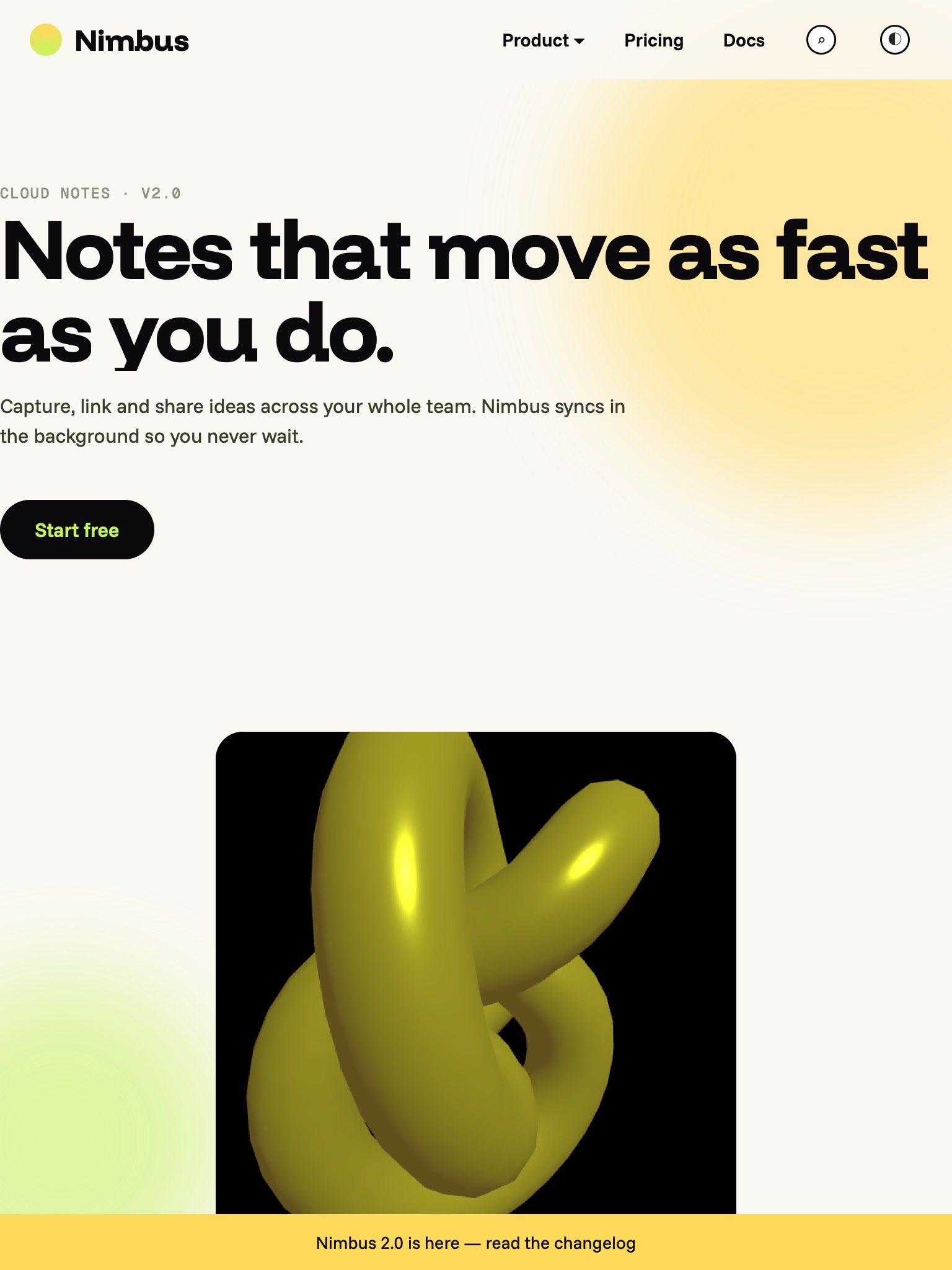

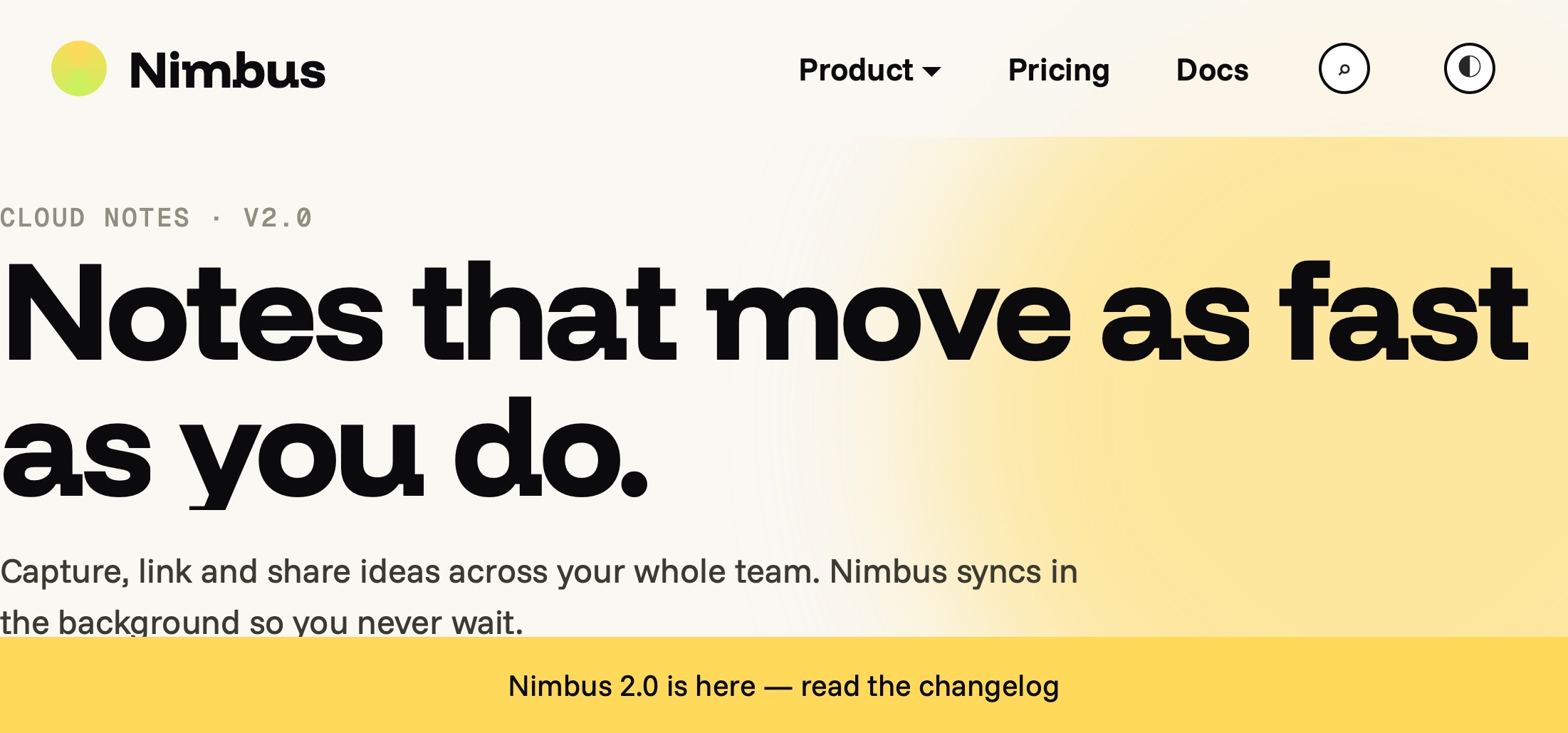
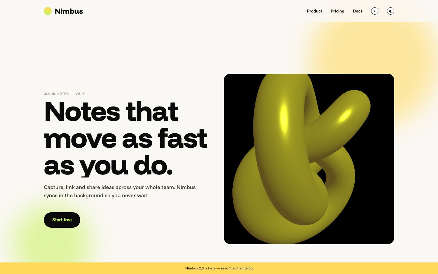
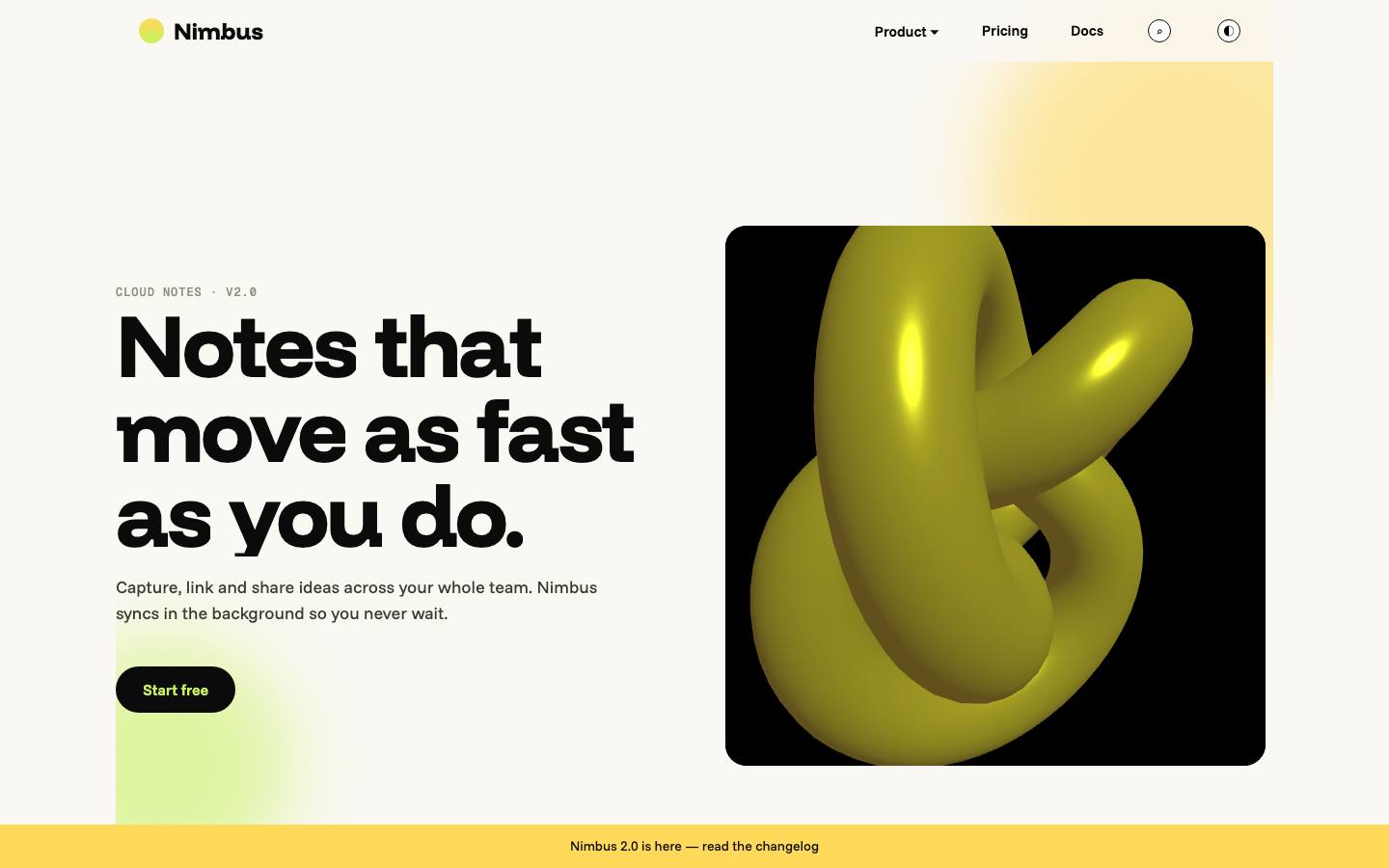


Desktop guard · section layout moved 20.6% (11→11 sections, page width 1744→1440px). ⚠ above 2% — open the desktop screenshots.
Remaining issues (0)
None. Ship it.
Fixed since baseline (17)
| Severity | Check | Element | Was | Devices |
|---|---|---|---|---|
| 4 · breaks | viewport-missing | head | No <meta name="viewport"> — phones render the page at ~980px and zoom out. → Add <meta name="viewport" content="width=device-width, initial-scale=1, viewport-fit=cover"> | 7 |
| 4 · breaks | overflow-x | div.wrap > div.reveal:nth-child(1) > img.shot:nth-child(1) | Page is 1624px wide on a 980px viewport — horizontal scroll. Widest offenders: div.wrap > div.reveal:nth-child(1) > img.shot:nth-child(1) (1600px wide, +644px past edge); header.wrap.hero > div.orb.a:nth-child(1) (420px wide, +340px past edge); #start > div.card:nth-child(2) (576px wide, +220px past edge); section.wrap.stats > div.stat:nth-child(4) (282px wide, +220px past edge); section.wrap.stats > div.stat:nth-child(4) > b:nth-child(1) (282px wide, +220px past edge) → Fix the root cause: fixed px widths → min()/clamp()/%, grid columns → minmax(0,1fr), images max-width:100%, nowrap headings → wrap or clamp(). overflow-x:clip on html is the LAST resort. | 7 |
| 3 · wrong | fixed-width-rules | .wrap | 5 unconditional CSS rule(s) set width/min-width > 430px: .wrap { width:1200px }, #scene { width:560px }, .panel { width:720px }, .shot { width:1600px }, video { width:1152px } → Replace with width:min(1200px,100%) or max-width + width:100%; use clamp() for fluid sizes. | 7 |
| 3 · wrong | no-breakpoints | stylesheets | No @media (min/max-width) rules anywhere — layout cannot adapt. → Author mobile-first and add breakpoints where the content breaks (not device sizes). | 7 |
| 3 · wrong | input-font | #start > div:nth-child(1) > form:nth-child(2) > input:nth-child(1) | font-size 12px — iOS Safari auto-zooms the page on focus. → Set inputs to font-size:16px (or 1rem) and add inputmode/enterkeyhint/autocomplete. | 7 |
| 3 · wrong | tap-targets | nav > div.wrap:nth-child(1) > ul:nth-child(2) > li:nth-child(1) > a:nth-child(1) | 6 interactive element(s) smaller than 44×44: nav > div.wrap:nth-child(1) > ul:nth-child(2) > li:nth-child(1) > a:nth-child(1) 50×18; nav > div.wrap:nth-child(1) > ul:nth-child(2) > li:nth-child(2) > a:nth-child(1) 45×18; nav > div.wrap:nth-child(1) > ul:nth-child(2) > li:nth-child(3) > a:nth-child(1) 32×18; nav > div.wrap:nth-child(1) > ul:nth-child(2) > li:nth-child(4) > button.icon-btn:nth-child(1) 24×24; nav > div.wrap:nth-child(1) > ul:nth-child(2) > li:nth-child(5) > button.icon-btn:nth-child(1) 24×24; #start > div:nth-child(1) > form:nth-child(2) > button:nth-child(2) 91×30 → Give controls min-height:44px / min-width:44px via padding; for icon buttons keep the glyph small and enlarge the hit area with padding or a ::before pseudo-element. | 7 |
| 3 · wrong | hover-only | nav li:hover .menu | 2 :hover rule(s) reveal/hide content outside @media (hover:hover): nav li:hover .menu → display; .card:hover .more → opacity. Touch devices have no hover — content is unreachable or sticks after tap. → Wrap decorative hover in @media (hover:hover) and (pointer:fine). Hover-revealed menus/tooltips need a tap toggle (aria-expanded) or must be visible by default on touch. | 7 |
| 3 · wrong | video-attrs | video | autoplay without muted (blocked on iOS/Android); no playsinline (iOS opens full-screen player); no poster → <video autoplay muted playsinline loop poster="…" preload="metadata"> | 7 |
| 3 · wrong | canvas-dpr | #scene | Canvas backing store is 1470×1470 for a 560×560 CSS box (ratio 2.63, device DPR 2.625) — Three.js renders 7× the pixels a phone can show. → renderer.setPixelRatio(Math.min(devicePixelRatio, 2)) — 1.5 on pointer:coarse or hardwareConcurrency<=4; size the canvas from its container with ResizeObserver. | 3 |
| 2 · should fix | tiny-text | nav > div.wrap:nth-child(1) > ul:nth-child(2) > li:nth-child(4) > button.icon-btn:nth-child(1) | 12 text element(s) under 12px: nav > div.wrap:nth-child(1) > ul:nth-child(2) > li:nth-child(4) > button.icon-btn:nth-child(1) 11px; nav > div.wrap:nth-child(1) > ul:nth-child(2) > li:nth-child(5) > button.icon-btn:nth-child(1) 11px; header.wrap.hero > div:nth-child(3) > span.mono:nth-child(1) 11px; section.wrap.features > div.card:nth-child(1) > span.n:nth-child(1) 11px; section.wrap.features > div.card:nth-child(2) > span.n:nth-child(1) 11px → Minimum 12px for labels/captions, 16px for body copy on phones. | 7 |
| 2 · should fix | vh-units | .hero | 3 rule(s) use 100vh: .hero { height:100vh }; .gallery { height:100vh }; .gallery .rail { height:100vh }. On mobile Safari/Chrome 100vh is taller than the visible area while the URL bar shows, so content hides behind the bar and layouts jump. → Use height:100svh (or 100dvh for pinned/full-screen) with a 100vh fallback line before it. | 7 |
| 2 · should fix | safe-area | div.bar | 1 fixed bottom bar(s) and no env(safe-area-inset-*) anywhere in CSS — the home indicator overlaps them on iPhone. → padding-bottom: calc(12px + env(safe-area-inset-bottom)); plus viewport-fit=cover in the meta. | 7 |
| 2 · should fix | img-srcset | div.wrap > div.reveal:nth-child(1) > img.shot:nth-child(1) | 1 large image(s) (>1200px) served without srcset: div.wrap > div.reveal:nth-child(1) > img.shot:nth-child(1) 1600px — phones download desktop bytes. → Add srcset + sizes (or <picture>), loading="lazy" below the fold, decoding="async". | 7 |
| 2 · should fix | reduced-motion | stylesheets | Animations present (GSAP, ScrollTrigger, Three.js) but nothing honours prefers-reduced-motion. → gsap.matchMedia() with "(prefers-reduced-motion: reduce)" → duration 0 / static state; CSS: @media (prefers-reduced-motion:reduce){*{animation:none!important;transition:none!important}}. | 7 |
| 1 · nice to have | body-font | body | body font-size 15px — readable but tight on phones → Prefer 16px base below 768px. | 7 |
| 1 · nice to have | img-dims | img | 4 images lack width/height attributes — layout shift while loading. → Add intrinsic width/height attributes (CSS can still set max-width:100%; height:auto). | 7 |
| 1 · nice to have | st-mobile-config | ScrollTrigger | 1 pinned section(s); ScrollTrigger mobile config not detected (ignoreMobileResize / normalizeScroll). → ScrollTrigger.config({ ignoreMobileResize:true }); consider ScrollTrigger.normalizeScroll(true) for pinned scrub on iOS. | 7 |
Emulated WebKit/Chromium via Playwright — not real iOS Safari or Samsung Internet. Spot-check the worst device on a real phone before shipping.